
Treasures: Timeless Design
Graphic design professor Nahid Tootoonchi has been fascinated by pen and ink since she was a child.
“I was interested in black and white even before I knew how to write,” she says. “When I was younger, my sister dropped the inkwell I was using onto the carpet. The pen nib went through her skin, and she still has a couple of small tattoos from that.”
Tootoonchi teaches a variety of classes in the Department of Art + Design, Art History, Art Education, but her students know of her deep love for typography. She earned an undergraduate degree in graphic design from Southampton College of Art (England) and a master’s in communication art from the School of the Art Institute of Chicago, spending most of her career creating digitally.
“I tried calligraphy for about a year when I was doing my master’s degree,” Tootoonchi says. “But I stopped until I became interested in poster design in Iran, around 2007 or 2008. It is famous internationally within the design community, and I was really intrigued by how they use calligraphy, typography and their ancient art effects in designing for the 21st century.”
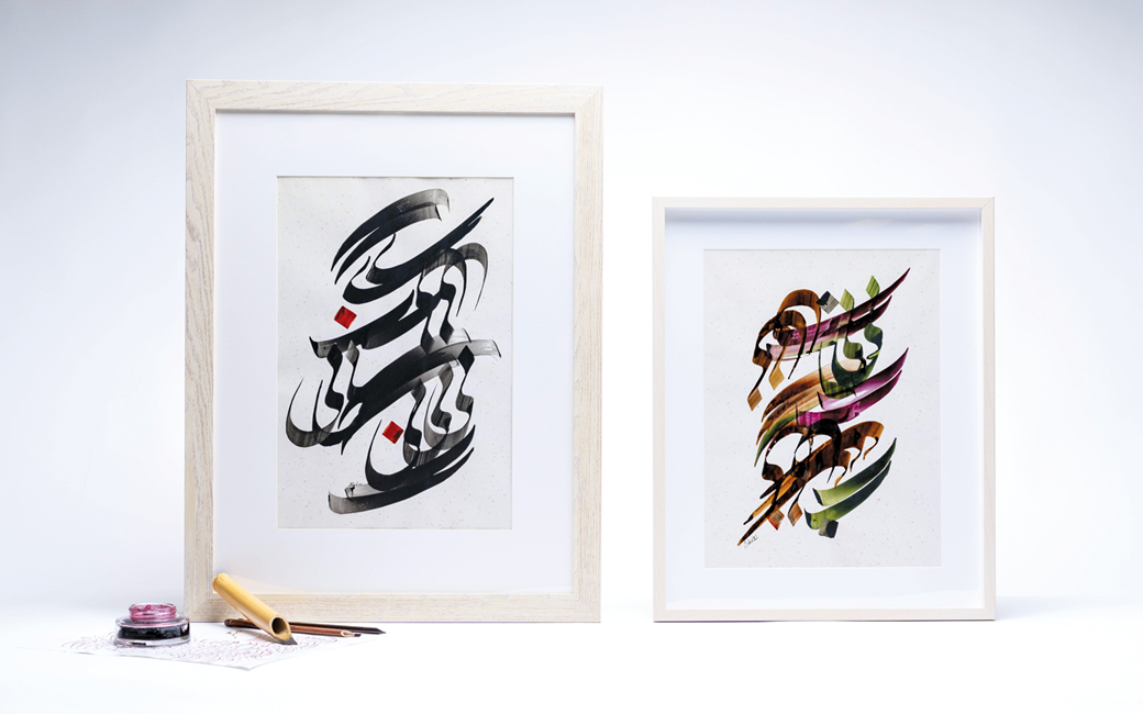
Earlier this year, she took a workshop in Morocco with a master calligrapher to explore the use of the letterforms as a medium for her artwork, calling practicing calligraphy a “lifetime learning process.” One she finds very meditative.
“While writing, your pen, your hand, your body join, and you have no choice but to concentrate on that simple movement,” she says. “You think about the content to determine how you want to write it. That’s very important. When I was in Marrakech, we worked on a poem by Rumi that says,‘We are the body, the holder but our being is from her/him.’ The work must have many different layers behind the poetry to truly convey the meaning.”
Tootoonchi practices a 14th-century Persian style called Nastaliq, using organic inks written with a bamboo pen on handmade paper.
“Let’s say you’re writing the word silent,” Tootoonchi says. “The stroke of one of the letters may be drawn much longer to convey its meaning. In the English alphabet, letters sit side by side to create a word. In Farsi, sometimes letters stack on top of one another to create a word, and letters must connect to read easily. The shape of a letter changes if it’s used in the beginning, middle or at the end of a word, so there is a lot of potential for being playful, becoming an art form.”