Preview in Mobile
Want to preview your website on mobile devices? Find out how in this PDF.
Create content that’s accessible to all audiences and reach them on their chosen device platform — whether they're using a tablet, smart phone or even a watch.

Towson University provides training resources to assist web editors in understanding accessibility standards and how to achieve them when posting content.
If you are aware of (or if you are) a website visitor who is having trouble using an adaptive technology within our site, please send an email with the page’s web address and a description of the problem to ada AT_TOWSON.
Towson University’s website has been designed to work “responsively.” This means the design conforms to the shapes and demands of different devices, from phone and tablet to desktop computer and TV.
The value of clean and clear content is immediately apparent when websites are viewed on mobile devices. Smaller screens make long, meandering passages intolerable. Help users find what they need by prioritizing your page content. Important content should be placed in the main content region in order of importance. Provide the essential and eliminate content clutter.
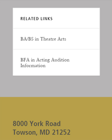
When viewing a webpage on a mobile device, the intro text region will display first, followed by the main content region, followed by the right column region, followed by the full-width region. The highest priority content should always be placed in the main region. On a mobile device, right column content (for example, related links) will display low on the page and should therefore never be critical information.
In addition to displaying your content in priority order, it is also important not to reference content with directional terms. For example, don't say “see the related links on the right” because right column callouts will not display on the right for mobile users.

When using a mobile device, some hyperlink behaviors (i.e., roll-over highlighting) will not display as they do on a desktop computer. For this reason it’s important to write clear calls-to-action for the following snippets so that users understand that pressing their screen over these snippets will link them to another page or document.
See the Snippet Library for more information.