


University Brand Marks
The TU brand mark is modern and timeless, inspired by the bold pattern in Maryland’s state flag.

The university brand marks are rooted in Towson University’s past, and designed for TU’s future. Use these primary, formal marks on all university branded materials.

TU’s Horizontal Brand Mark
This version of the brand mark should be used whenever possible for both printed and digital items. The brand mark has been carefully crafted and should be used exactly as seen here. Don’t add, alter or remove any graphic elements, in order to keep the integrity of the mark. Do not create or add additional characters to this mark.
Download Files (Login)

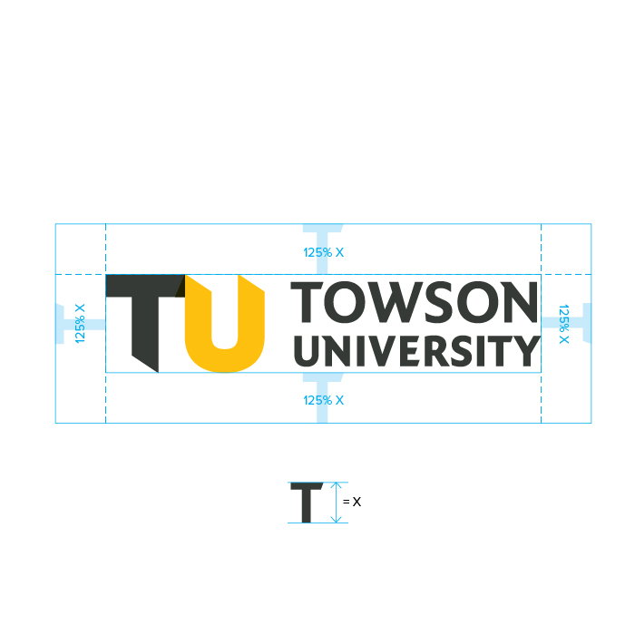
Horizontal Brand Mark Clearing
To ensure the brand mark is never crowded or overshadowed by other elements, it’s important to adhere to these guidelines. The clearing space on the top, bottom, left and right of the brand mark is % of the height of the “T” in “TOWSON” from the wordmark. No elements or graphics should encroach on the clearing space, so the brand mark stands out wherever it’s used.
Horizontal Brand Mark Minimum Size
TU’s brand mark should always be readable – we want people to see it. It should never be used smaller than the minimum size shown here – 125 pixels or 7/8” across.

TU’s Vertical Brand Mark
This is the secondary version of our brand mark. This version of the brand mark can be used if space or composition calls for a more vertical orientation. The brand mark has been carefully crafted and should be used exactly as seen here; do not add, alter or remove any graphic elements, in order to keep the integrity of the mark. Do not create or add additional characters to this mark.
Download (Login)
Vertical Brand Mark Clearing
To ensure the brand mark is never crowded or overshadowed by other elements, it’s important to adhere to these guidelines. The clearing space on the top, bottom, left and right of the brand mark is 150% of the height of the “T” in “TOWSON” from the wordmark. No elements or graphics should encroach on the clearing space, so the brand mark stands out wherever it’s used.

Vertical Brand Mark Minimum Size
Our brand mark should always be readable – we want people to see it. It should never be used smaller than the minimum size shown here, 100 pixels or one-half inch across.

Variations
Both the horizontal and vertical brand marks have multiple color variations. The full color brand marks shown here are preferred in all print and digital applications. The one-color black and white marks should only be used for projects or publications requiring a black and white logo.
Download Files (Login)
The Graphic TU Brand Mark
The graphic TU may be used without the accompanying Towson University text:
- By itself as a brand mark when the audience is familiar with the university — on campus or with an exclusively alumni audience
- As a supplemental graphic when the horizontal or vertical university brand mark has been previously introduced. For example, as a graphic on interior pages of a booklet that has a TU brand mark on the cover.
- When the name of the university is in proximity. A TU might be featured as a big graphic on a billboard that mentions Towson University in the headline.
The graphic TU is available for download in several brand color variations, including the gold + gold combination that is generally restricted to on-campus use.
Download Files (Login)
Graphic TU Brand Mark Clear Space
To ensure proper legibility and prominence, it is important that the graphic TU is never crowded or overshadowed by other elements. The clear space on the top, bottom, left and right of the brand mark is equal to the width of the U in the graphic TU. No elements or graphics should encroach on the clearing space, so the brand mark stands out wherever it’s used.
The graphic TU is available for download in several brand color variations, including the gold + gold combination that is generally restricted to on-campus use.
Download Files (Login)
Graphic TU Brand Mark Minimum Size
The simplicity of the TU means it can be very small, but there is a limit: In print, the TU should be used no smaller than 1/4" across; on screens, it may be no smaller than 20px.
Download Files (Login)
Partnership or Sponsorship
TU’s brand mark is often shown as one of several different logos. For example, when Towson University is sponsoring an event with other organizations, TU’s brand mark might be paired with the other organization’s mark. When pairing the university brand mark with brand marks from other entities, be sure to separate the brand marks with thin lines. Use the size of the marks to denote whether TU is an equal partner, or primary sponsor with other organizations playing a supporting role.
The graphic TU may not be used to represent Towson University when depicting partnerships or sponsorships.