


Typography
What’s that font? The words we use are important, and so is how they look.
Our typography provides additional style and consistency to the university’s brand. TU uses two primary typefaces to help bring character and personality to every word we choose: Proxima Nova and Kandal. The geometric sans serif typeface Proxima Nova and wedge serif typeface Kandal complement one another when paired together.
Both fonts were created by Mark Simonson, an artist specializing in type design and font. His mastery of both the artistic and technical skills needed to design typefaces fits perfectly with TU’s brand.

Primary Typeface
Proxima Nova (2005) bridges the gap between typefaces like Futura and Akzidenz Grotesk. The result is a hybrid that combines modern proportions with a geometric appearance.
Download Font (Login)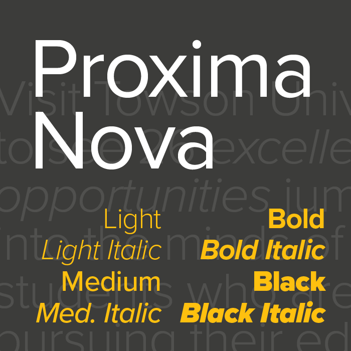

Primary Typeface
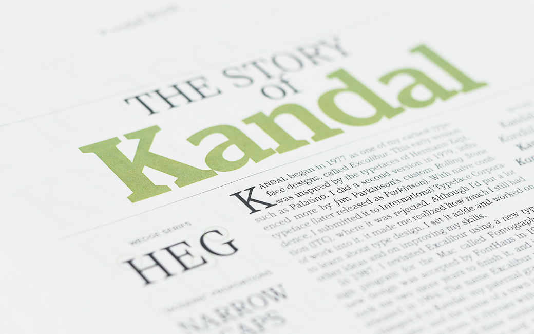
Kandal (1994) is a wedge serif design with some old style character. It follows the weight scheme typically used for slab serif typefaces, where the contrast between the thick and thin strokes remains relatively constant as they get thicker. Its proportions are rather narrow compared to other serif typefaces, especially for capitalized letters. The italic follows a modern cursive style of construction.
Download Font (Login)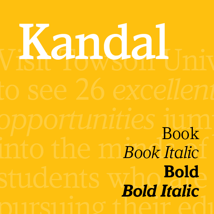
System Typefaces
For applications such as email, PowerPoint or Keynote presentations or any other communication where live system fonts are required and the primary typefaces are not available, please use the sans serif typeface Arial and the serif typeface Georgia.