
Digital Art & Design
The art displayed below is part of the Senior Show Spring 2021. Artists include: Mady Balke, Stephanie Castedo, Jane Choi, Cyana Denby, Logan Gibson, Ashley Groff, Isabella Pennente, Tori Porter, Reilly Sharpless, Ronell Shears and Grace Welsh.
Mady Balke
Artist Statement
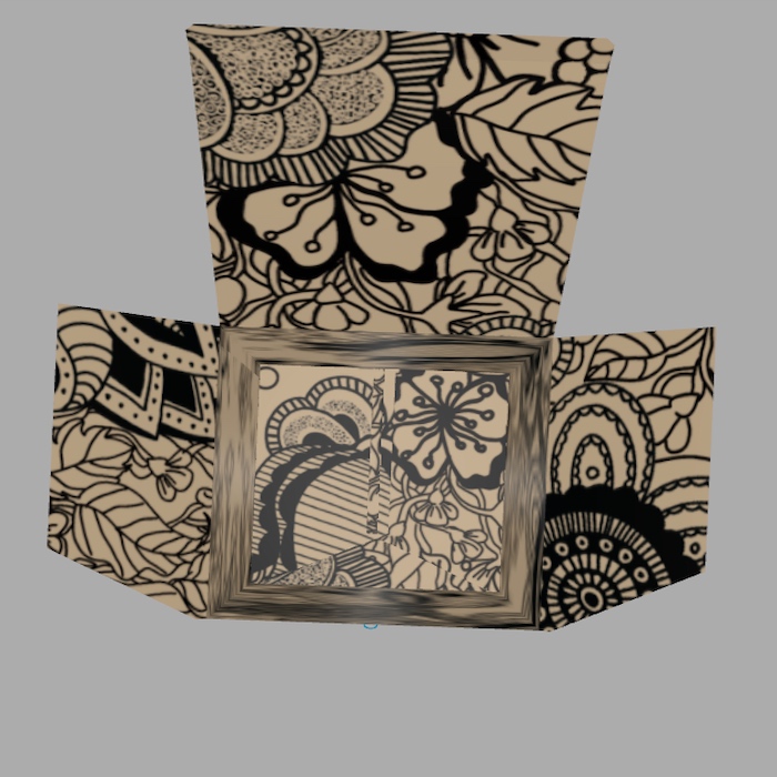
My work has been a process throughout two years of experimentation and world building. I’ve always been drawn to character creation and when I created Iso for “B-More Lights.” I felt a special connection with her and wanted to share her with others. I wanted to create an exciting story and make people happy through the beauty of animation. I have always wanted to make my own show and was always inspired by “Spirited Away” and the rest of the Studio Ghibli films. Those films and anime got me through such hard times and I want to bring that happiness into other people's lives. My anime is an action/adventure about the dragon girl Iso, protecting her new town from Demons.
— Mady Balke
Stephanie Castedo | Parturition
Artist Statement
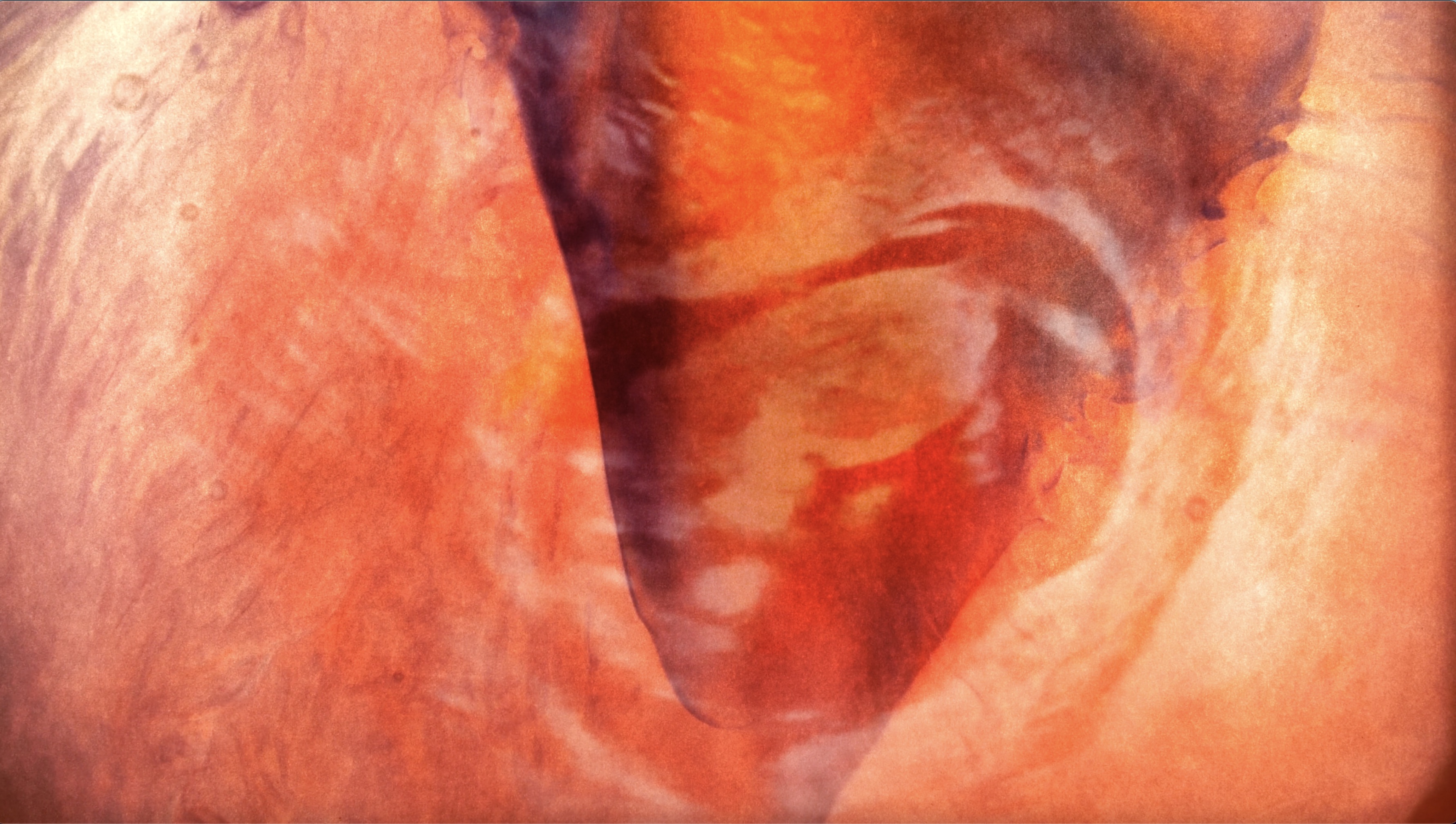
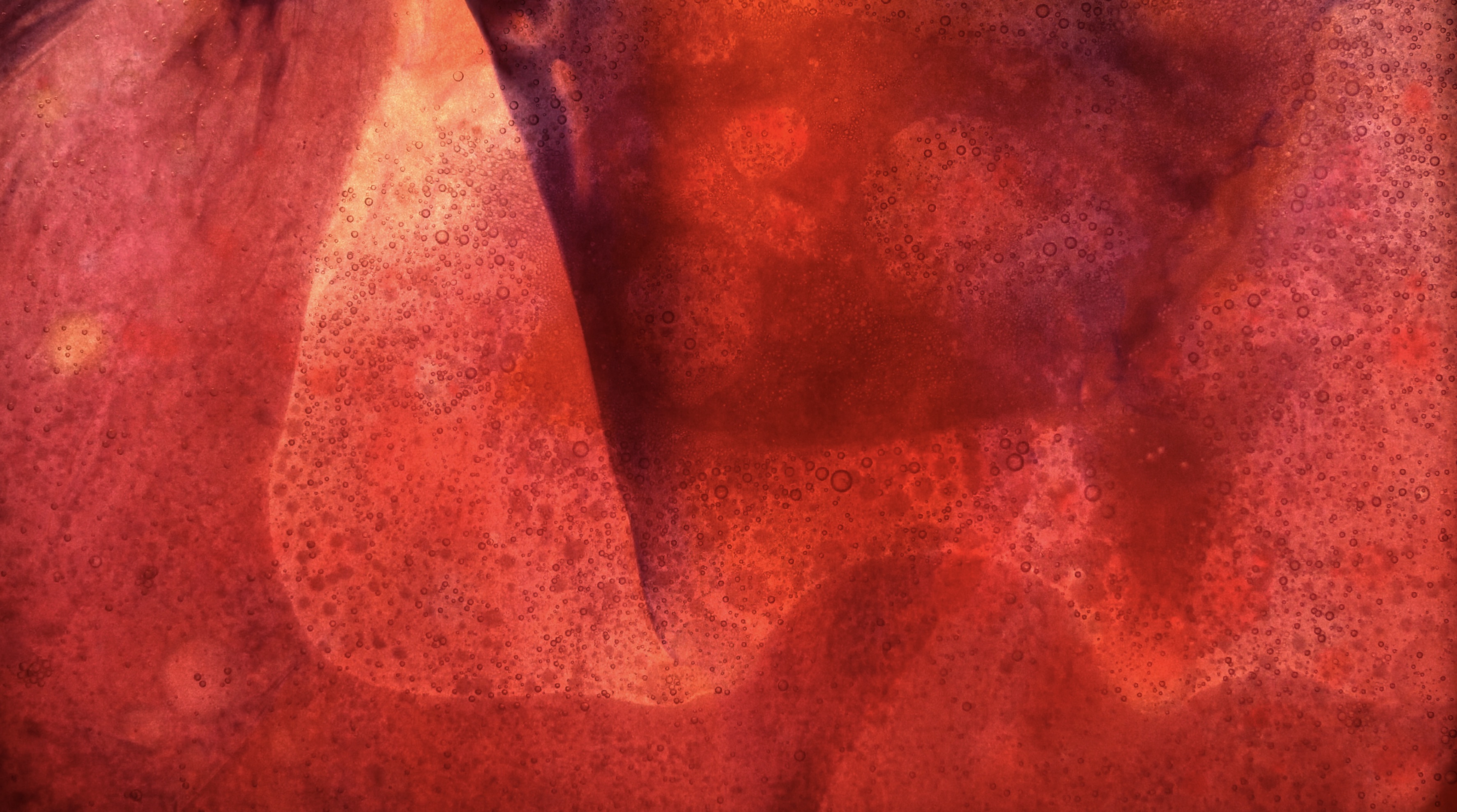
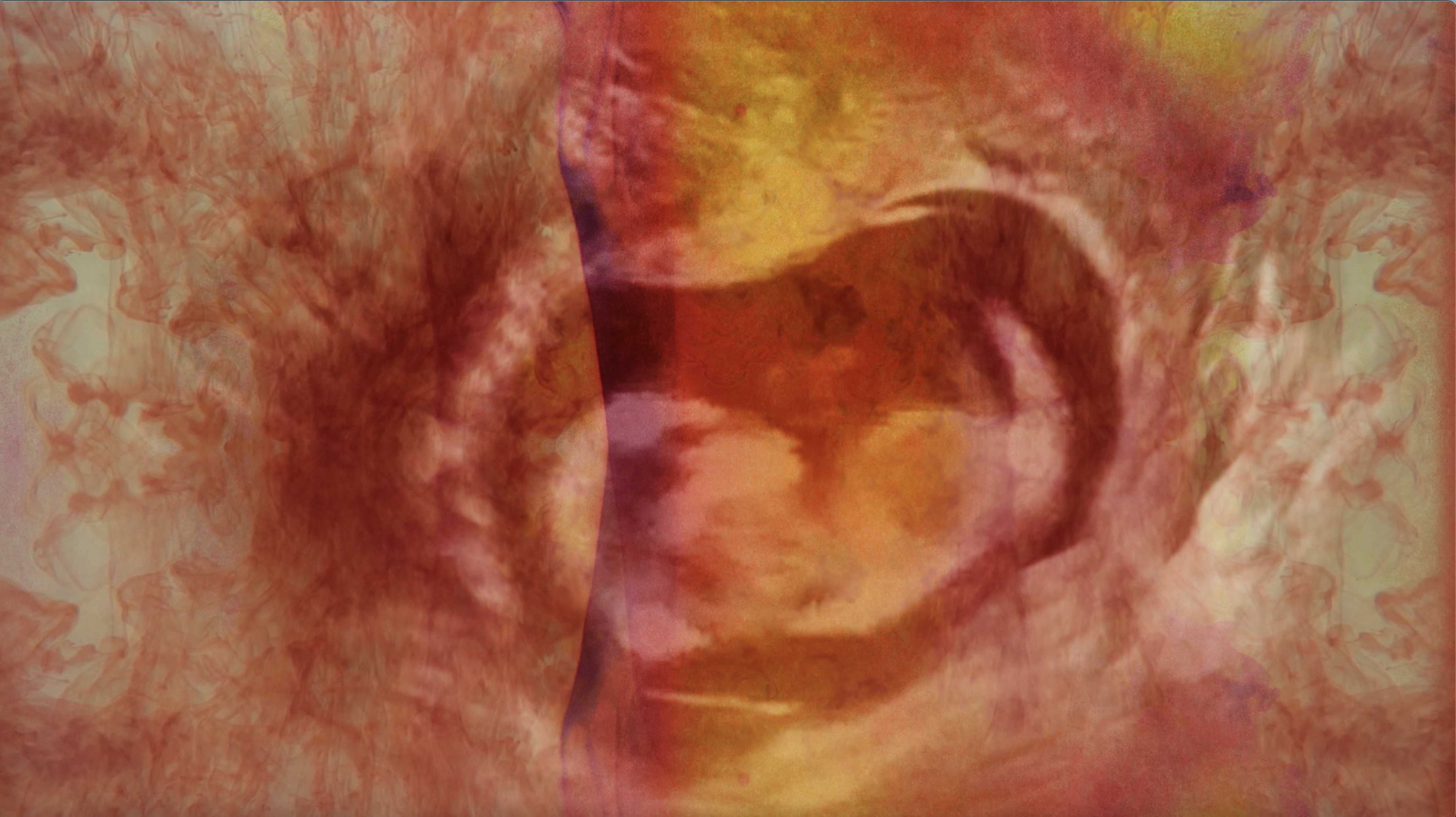
Parturition is a video installation that consists of fabric, thread, and a projected video on the background. It is a representation of the connection between mother and child. Beginning in the womb, it is the first time we truly experience a bond with someone. We experience every emotion the mother feels, whether it is happiness or sadness. The mental state of the mother is crucial as to how the baby will develop after it’s born.
I hope Parturition will bring the viewer a visualization of these feelings. To see how babies prepare for life based on messages the mother is providing and to experience their environment. I hope they feel and connect with this piece as much as I did.

Jane Choi
Artist Statement
My work is inspired by the process of creating characters and their details. When building a narrative, I create personalities that will fit in an environment and adapt to any situation. I apply backgrounds that make each protagonist/antagonist relatable and realistic. I also utilize traits and character development to strategically to allow viewers to build attachment to each one. Once their backgrounds and traits are set, I imagine how they would look and design them with features and colors that match them. My work understands the creative procedure of storyboarding and designing.
Parasite is a story with three unique characters that have distinct personalities compared to one another. It explores the psychological differences each person has, and how a relationship could play a role in changing someone’s views. The main character goes through a series of events that challenges his morals. My work was to dive into building a relatable personality that viewers could see themselves in and the tough decisions they must make.

Cyana Denby
Artist Statement
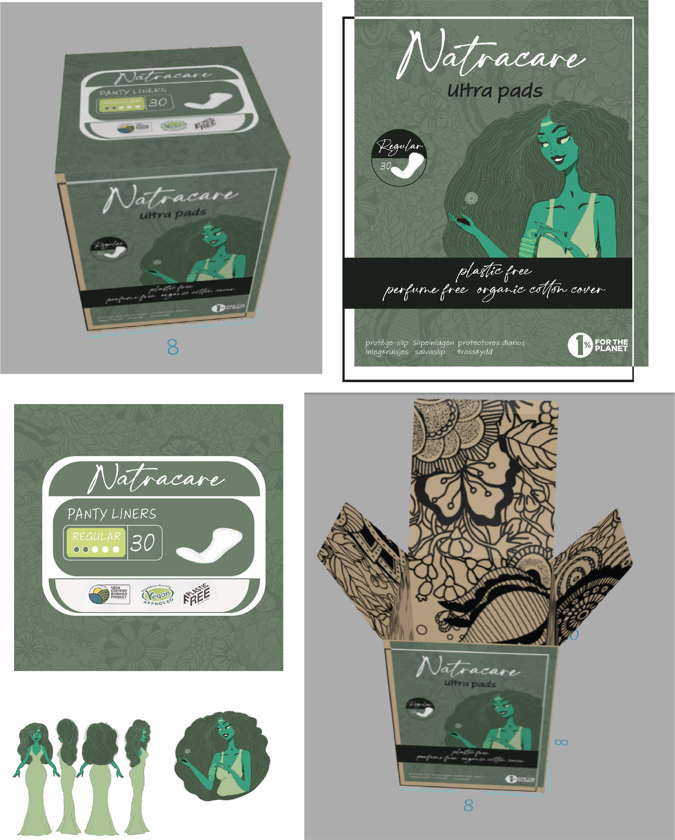
Being a digital artist is allowing me complete, extensive creative freedom. In my digital artwork, Natracare, I creatively elaborate on the issues of the feminine hygiene industry and the environmental issues that arise from it. Using imagery such as the waves in my character design that reference the natural flow of a menstrual cycle, highlights the diminishing connection we have with nature. To convey my message best, I use an iPad as a “canvas” to simulate the analog activity of drawing or painting. This allows me a physical, tactile association to the traditional forms of painting and drawing — all the while staying eco-friendly and paperless. With my digital creations I am trying to create something that can transcend the taboos surrounding periods and can be easily understood by anyone no matter their background.
- Instagram: @artistnamecz
Logan Gibson
Artist Statement
My work is not confined to one medium, -experimentation in many forms has allowed
me to be more creative and explorative. I have always made art that interests me and
I love to work with pop culture and science fiction themes. Growing up, I was glued
to my TV, whether I was playing games, or watching movies or shows. This has truly
influenced the artwork that I make today. Pop culture and Sci-Fi has had such a major
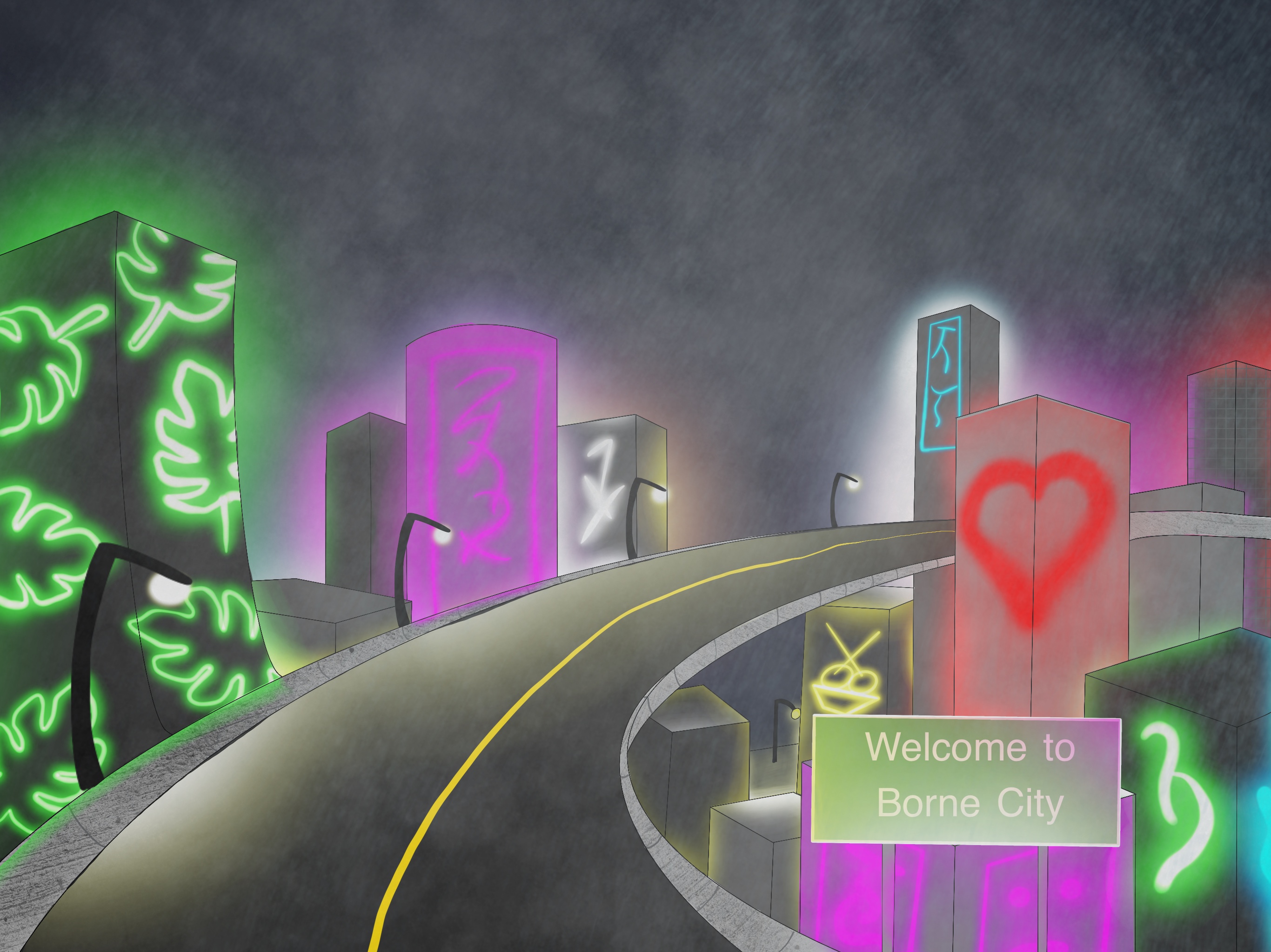
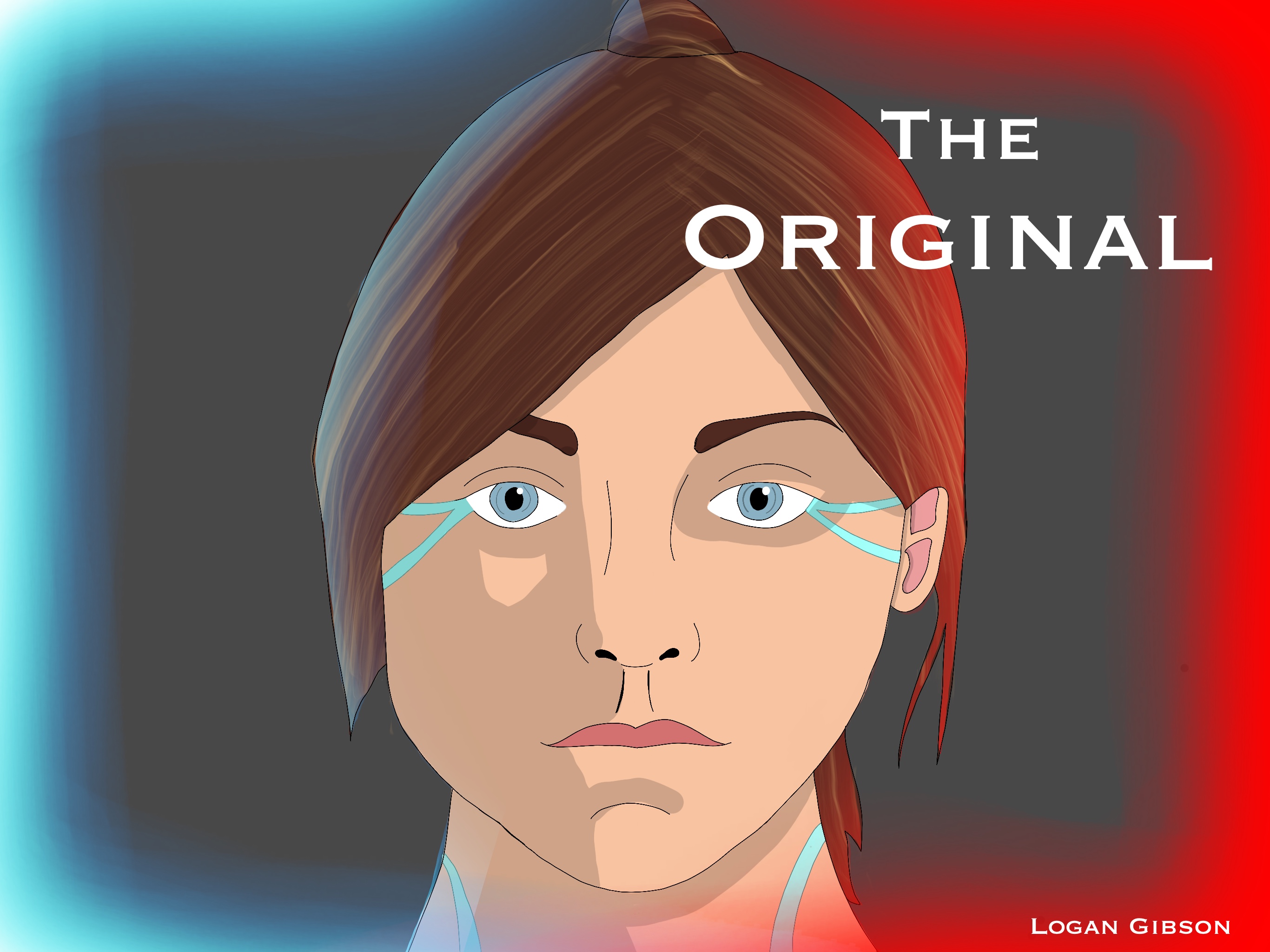
impact on my art that it inspired me to create a Sci-Fi comic, The Original, a story set in the distant future and centers around a girl named Kat, who is within
the lower class within society and only makes it by, by accepting any job offered
to her. Her most recent job ends up being more than she thought and raises more questions
than answers about who she really is. The Original explores themes of social class rank, technological advances, among other science
fiction themes.

Ashley Groff | Blast Off!
Artist Statement
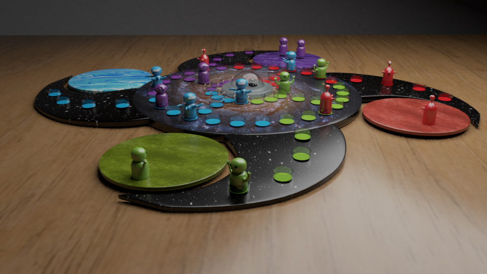
Blast Off! is a variation on the classic board game Trouble. The project scope consists
of the game design itself, as well as all the supplemental material that is required
to make a full game experience. I wanted to show off all the skills that I had learned
as a DAD major with Blast Off! while also playing with styles and themes that appear
throughout my body of work. The piece utilizes 3D modeling, graphic design, illustration,
and more, to create a realistic mock-up of what the game would look like in-person.

- Instagram: @ashleymg.arts
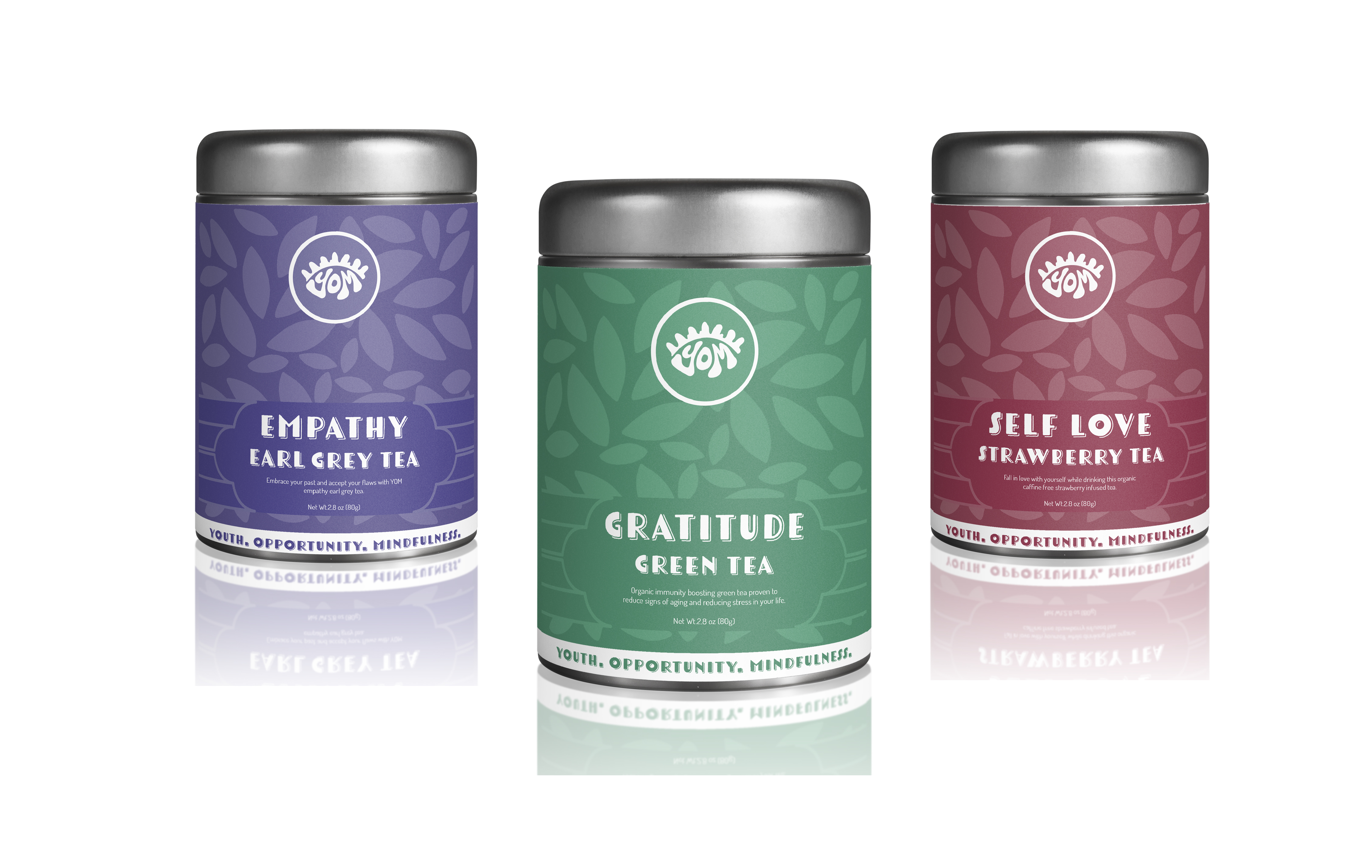
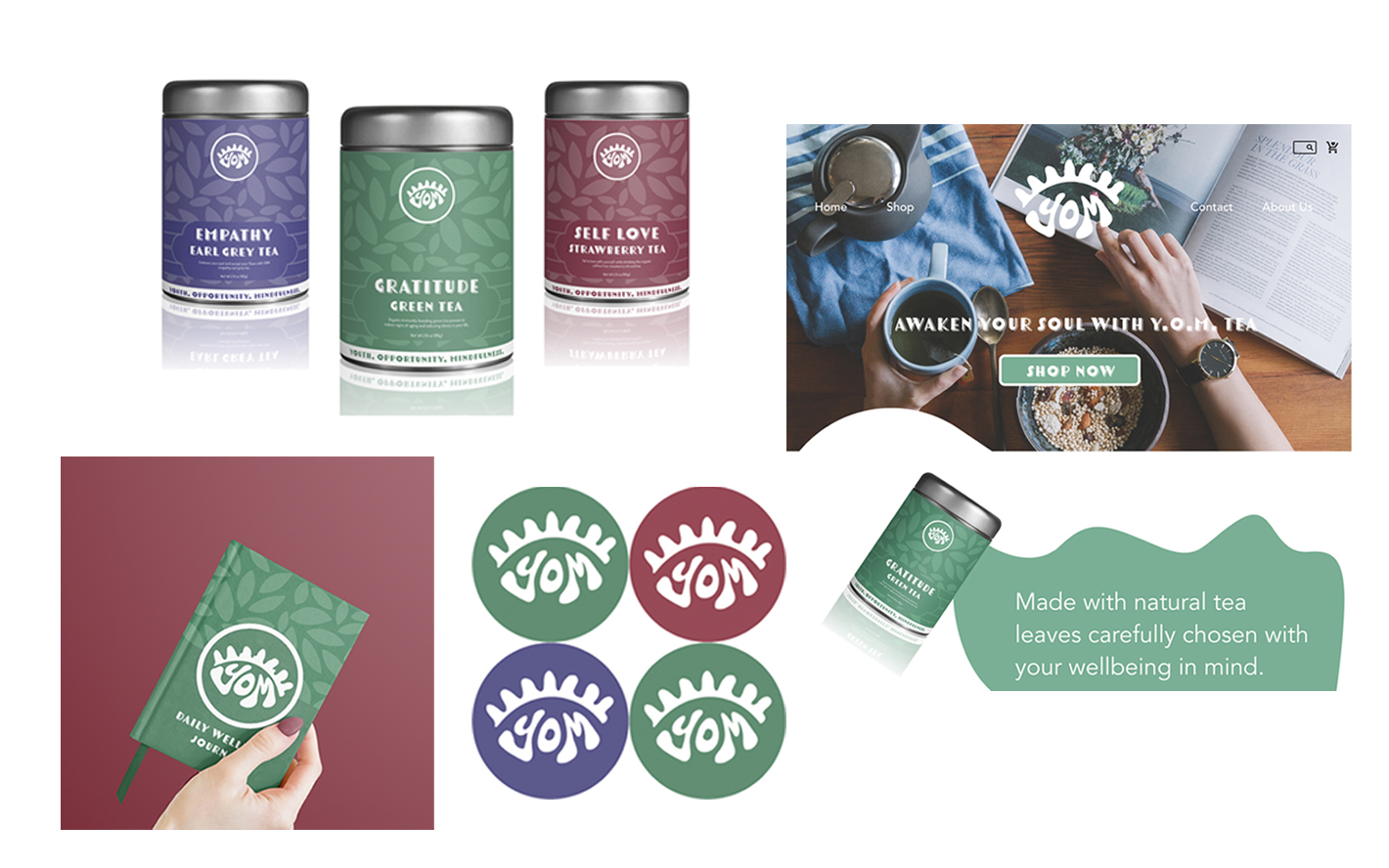
Isabella Pennente | Y.O.M. Tea
Artist Statement
The present moment is all we have. Mindfulness has become a major focus in my life,
and I wanted to create a concept for a tea brand that is a reminder of this. Y.O.M.
tea is a company targeted towards ages 18-25 years old that represents youth, opportunity
and mindfulness. The project consists of a logo, three tea flavors in cans, stickers,
a home page website mock-up and a journal all representative of the Y.O.M. brand.
Each of the flavors focuses on a different mental awareness from gratitude to self-love
and empathy. The illustrative look of this brand is inviting and calm, allowing customers
to focus more on the present moment than before. This project showcases the ability
to combine design, illustration and branding.

Tori Porter
Artist Statement
My creative work includes animation, character design, and illustration, and I view my art as a medium for storytelling. In my most recent project “Infernal apprenticeship”; I focus on making a short engaging animated story, which acts as a pilot for a longer show. It relies on dialogue and character actions to get the idea across to the audience as to who these individuals are and what their personalities are like. It explores the theme of “normalcy in the fantastical,” and juxtaposing weird outlandish elements with the mundanes of everyday life. Many of my works focus on this theme and rely on characters interacting and exploring the unknown to push the narrative. This style of storytelling is inspired by various media I’ve viewed, the most impactful being the Studio Ghibli film “Castle in the Sky.” The style of my work and character designs uses thick lines and simple shapes, this is inspired by the simplified illustrations of Lyle Tuttle’s tattoo work and Ken Sugimori’s character design work from the 90s which focused on defined shapes in a characters silhouette.
The main goal in many of my works is to engage viewers and make them interested in the world created, I want people to develop their own understanding of the characters, their personalities, and the environment they live in without it explicitly being told.
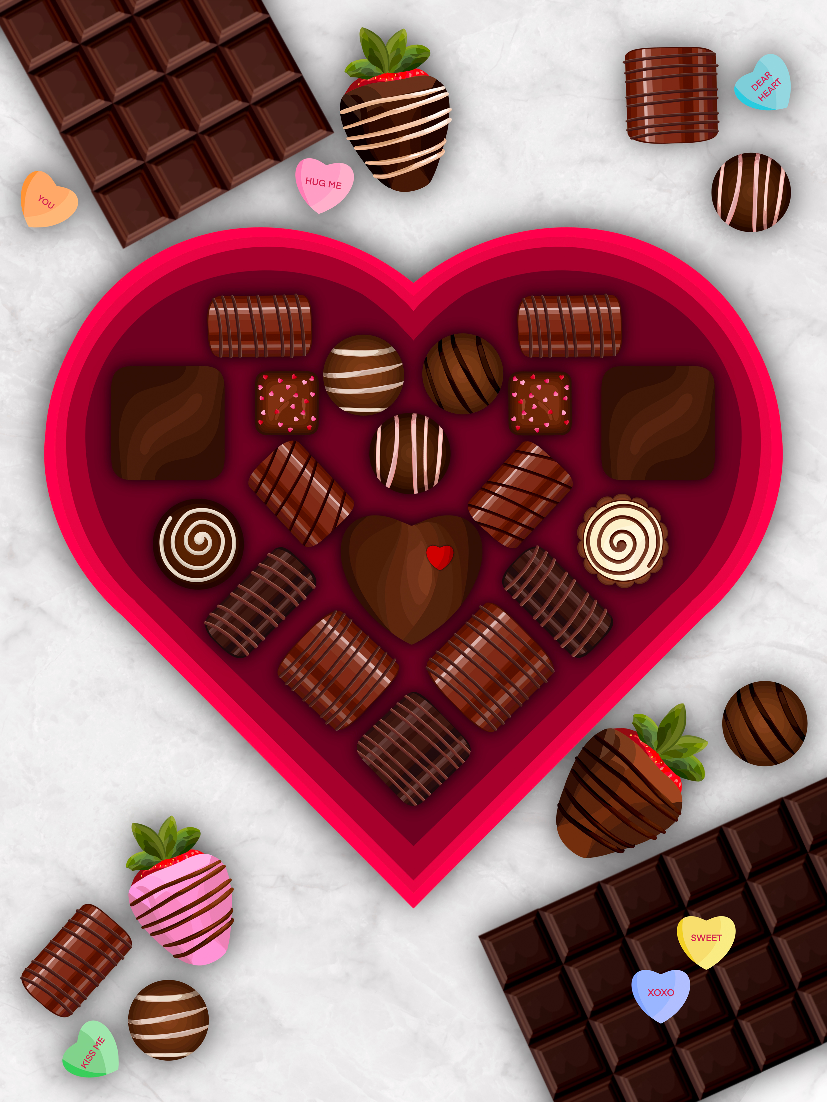
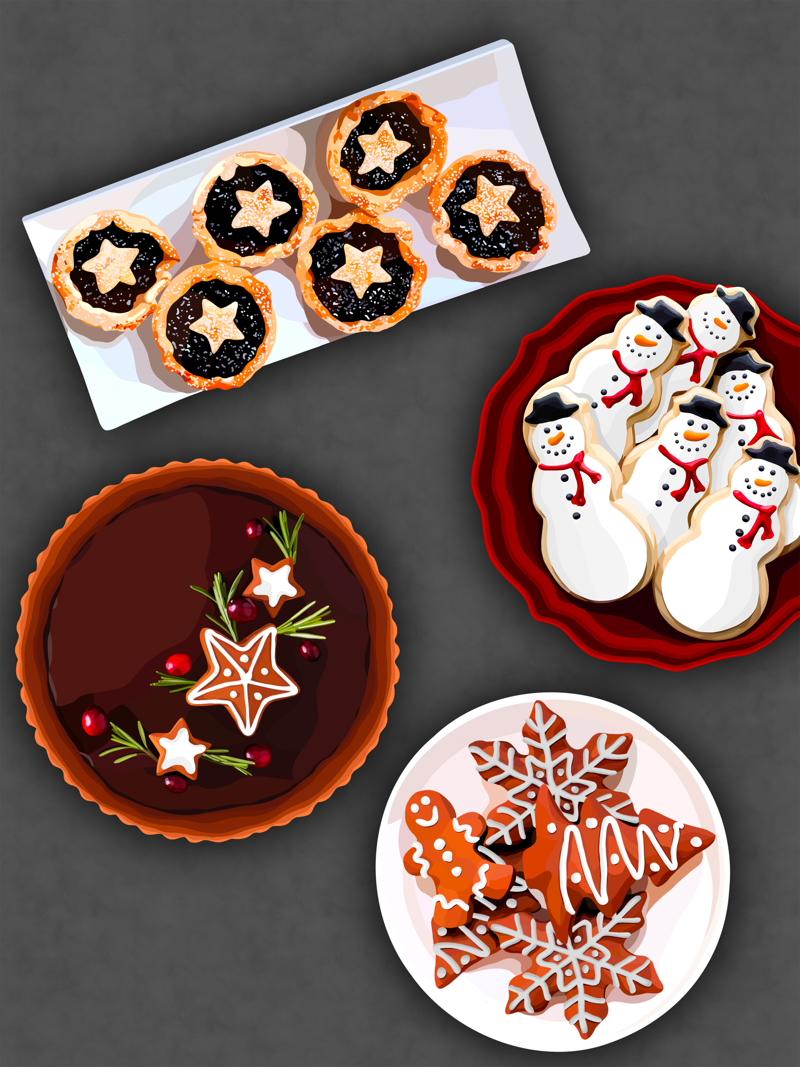
Reilly Sharpless | The Celebration of Food
Artist Statement
The Celebration of Food is a series that focuses on the power food has to bring people together. Being able to come together and share a meal is one of the most communal things we as humans can do together and is practiced almost worldwide. We all must eat, so being able to make a dish and then share it with others, especially the ones we love, is such a respected and universal concept.
I hope The Celebration of Food can help the viewer recognize these moments in time, these holidays, and times of celebration, and think of their own family and friends and the get-togethers and traditions surrounding them. Each family does things differently and has their own way of doing things, especially when it comes to holidays. Each family has a different culture, race, ethnicity, religion, and location, all of which influence our lives, traditions and ideals.
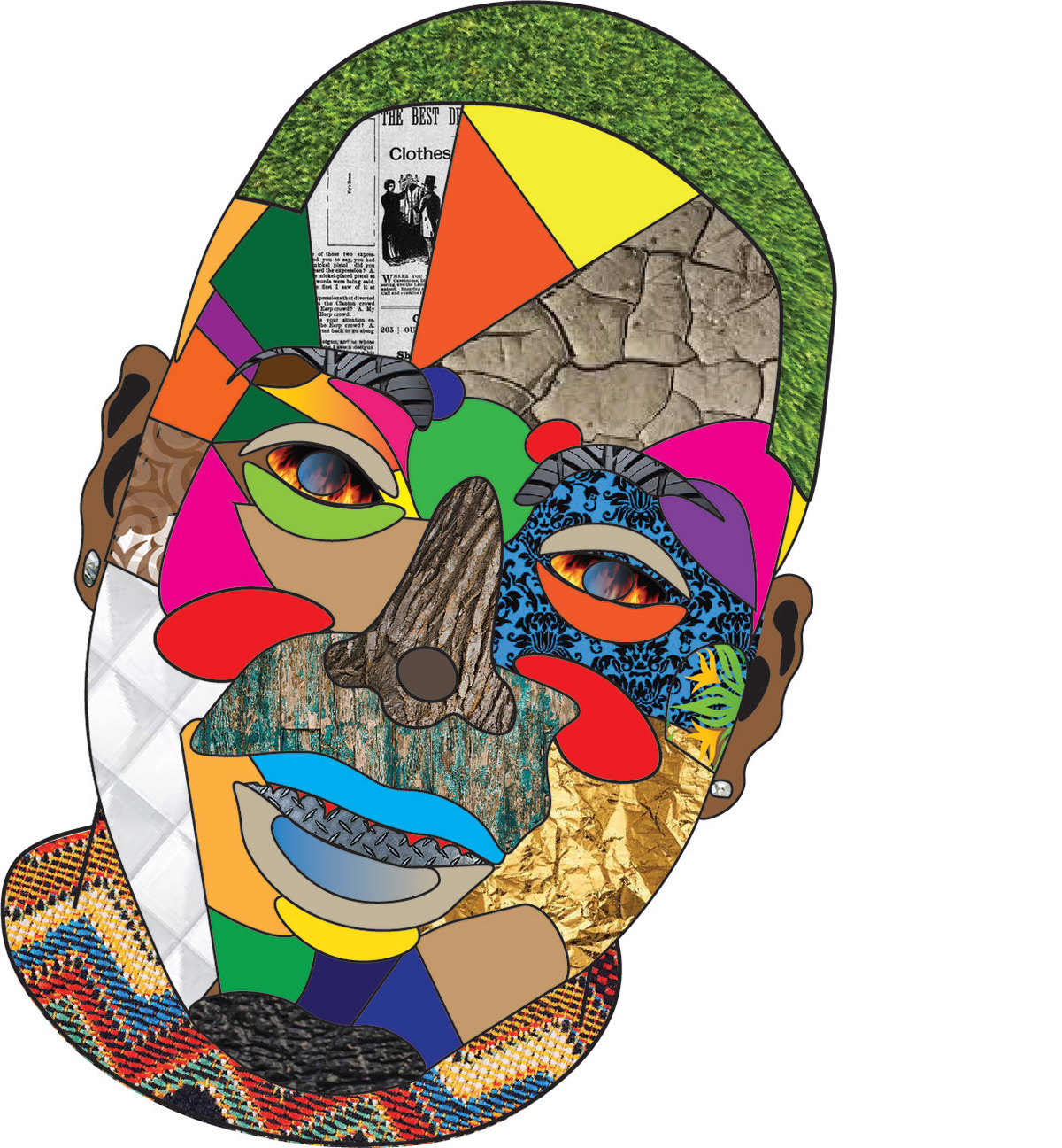
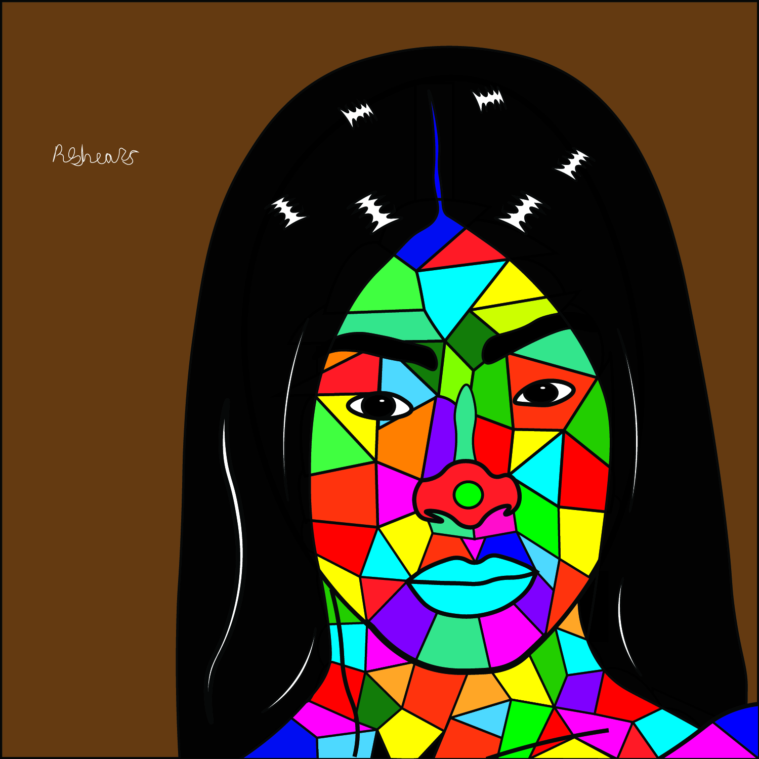
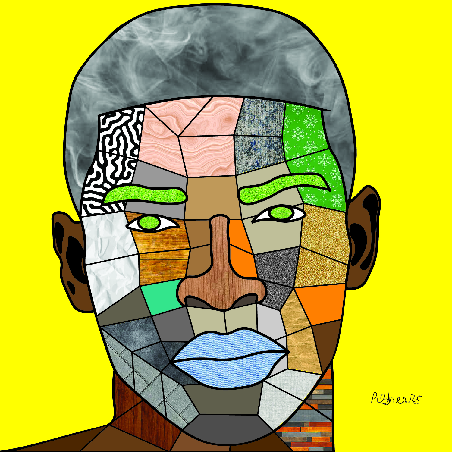
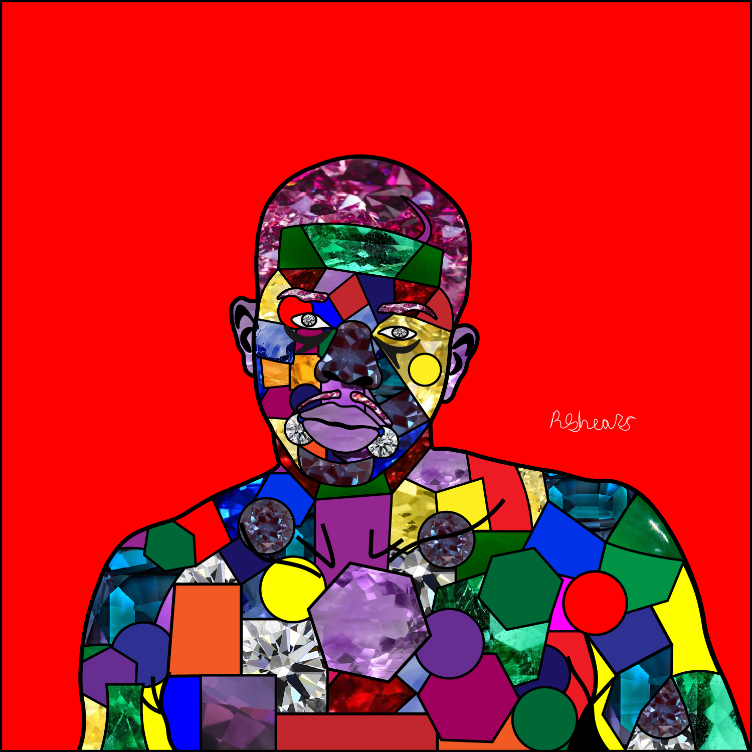
Ronell Shears
Artist Statement
My modern cubist portraits represent a historic style mixed with modern technique. I take inspiration from the cubist portraits that were done on paper with paint and recreate my own version in Adobe Illustrator. All the portraits were created using portrait photos of my friends who gave me consent. The first step of my process is the line structuring for each portrait. I dare say that it is also the most important step. By studying the layout and style of old historic cubic paintings, I was able to recreate and interpret the style in my own way using line, color, and textured images in adobe illustrator. I chose to do this as my BFA Project because I wanted to see if I can turn these portraits into some sort of a specialty of mine in the near future.
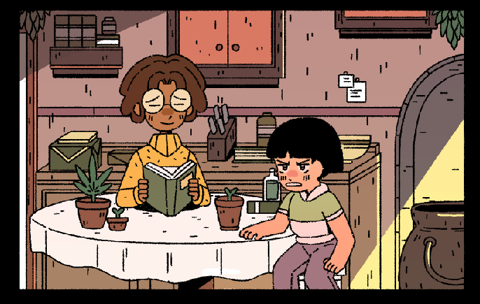
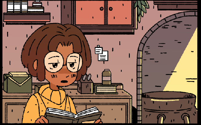
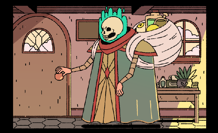
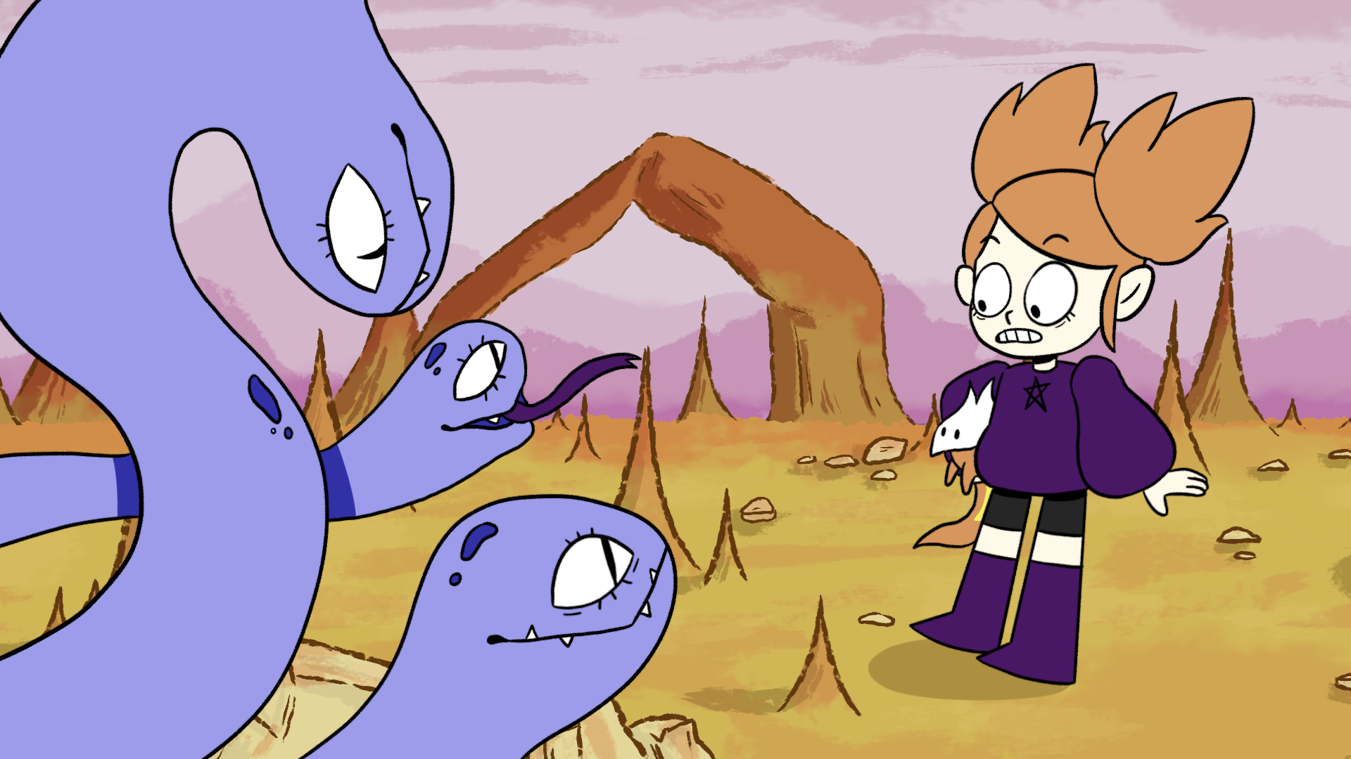
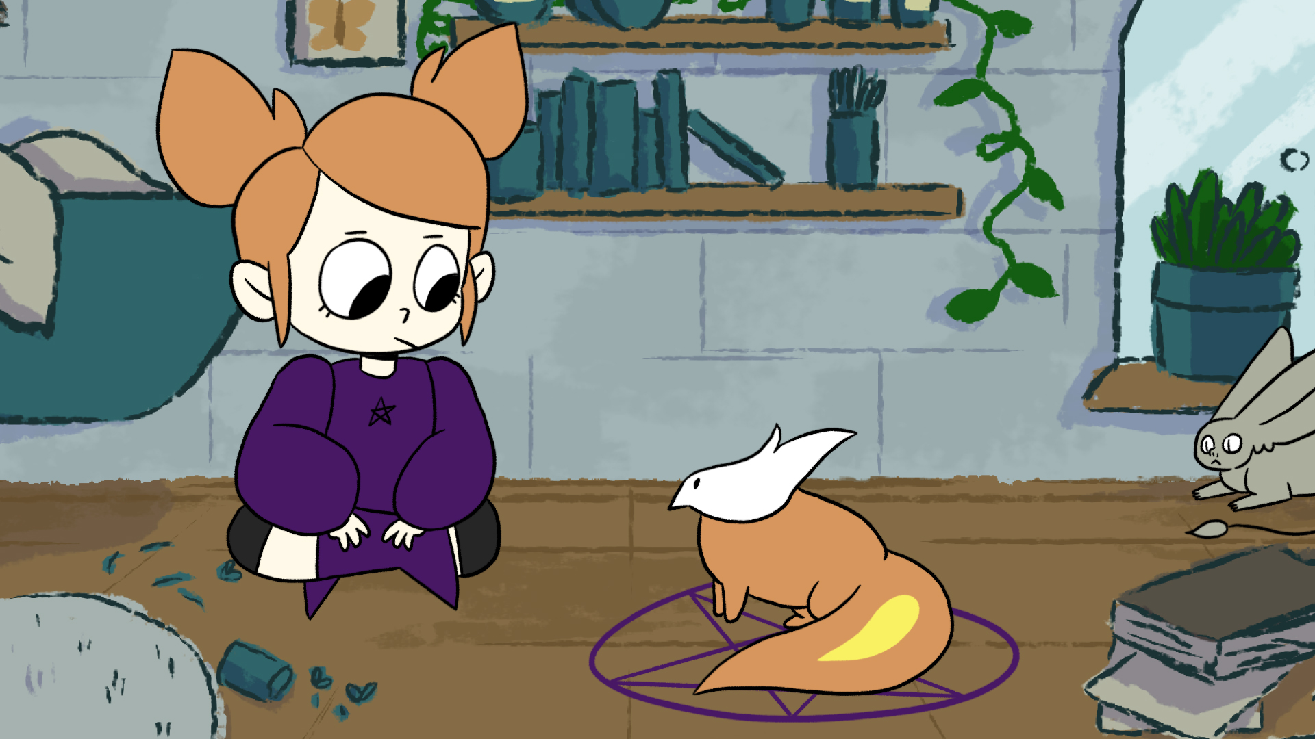
Grace Welsh | Summoning Disaster
Artist Statement
Growing up I immediately fell in love with the cartoon, Steven Universe, and knew that’s what I wanted to do. I love 2D animation because it’s a compelling way to visually show something with extremely exaggerated poses and expressions. “Summoning Disaster” came to me after a hiking trip to some old college ruins. There was a huge altar right in the middle of the woods and even though it was extremely decayed and falling apart, it was still beautiful to look at. I wanted to build a magic world that this altar lived in that could grant any wish with a twist. The story follows our main character’s Maddy and Squeak as they try to transform Squeak into his full potential after a failed summoning. I love to create stories with adventure and comedy because I want the audience to have a good laugh viewing my work.
- Instagram: @mozzarellabits